
Lamour
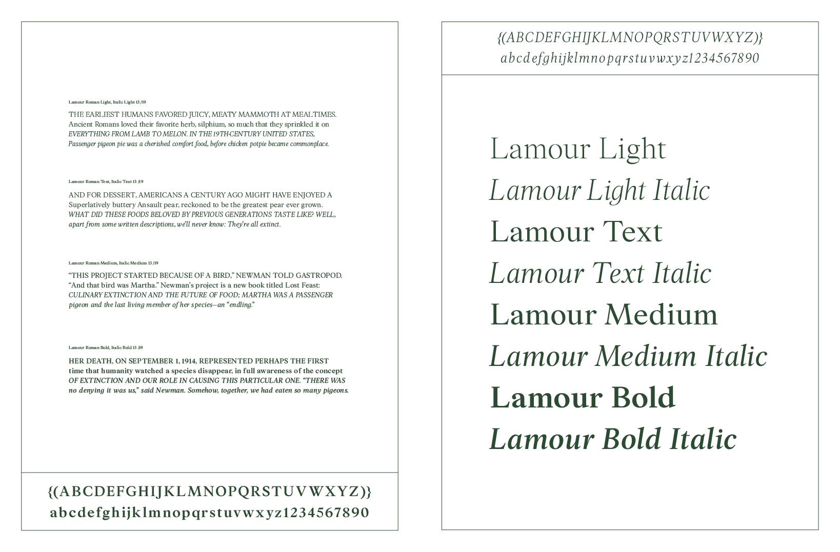
Inspired by Plantin and Arnhem. Lamour is my journey to explore between Romantic letter style and Renaissance form. It is a transitional typeface family that is suitable for setting long text while having a tender touch with italic style. It contains calligraphic stress with moderate contrast, making it characterful without being distracting. Its sophisticated looks are matched with an intelligent, anonymous nature; making it excellent for magazine, book, and editorial designs.
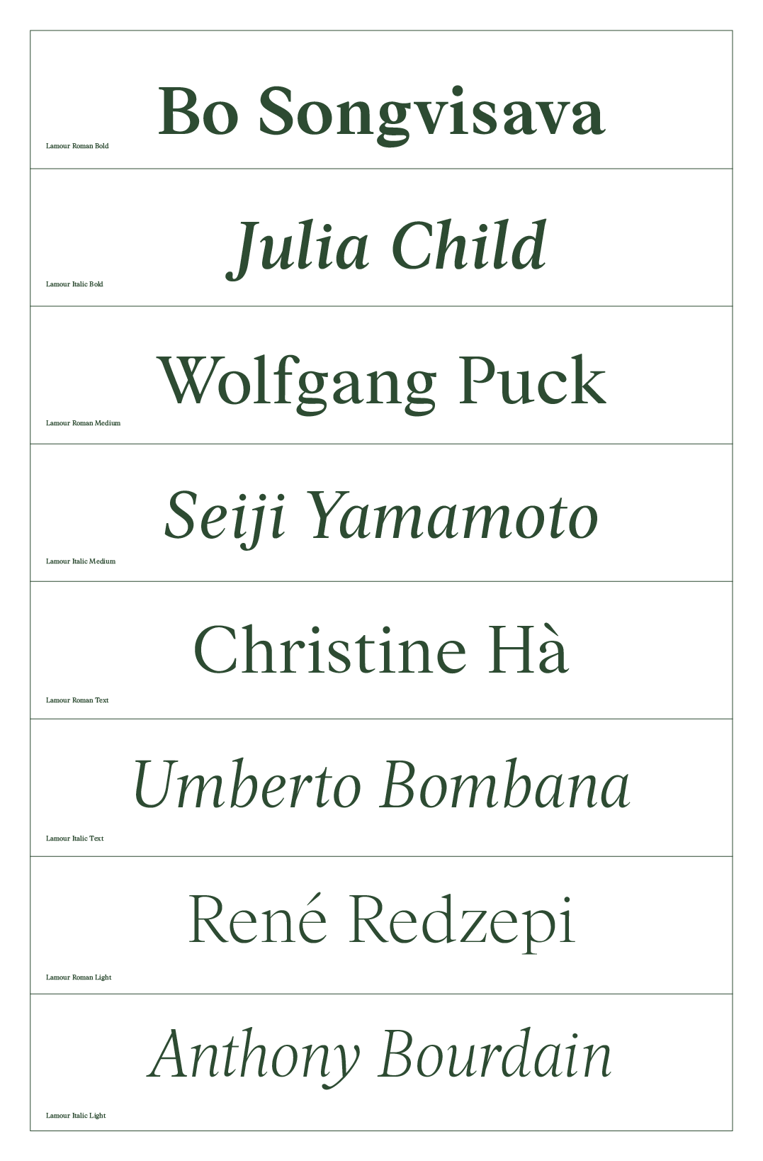
The Lamour family includes 4 weights along with italics. The italic style created a warm touch in the family.
Now available to try them on the textbox below:
The Lamour family includes 4 weights along with italics. The italic style created a warm touch in the family.
Now available to try them on the textbox below:
Lamour Bold︎
Lamour Bold Italic︎
Lamour Medium︎
Lamour Medium Italic︎
Lamour Text︎
Lamour Text Italic︎
Lamour Light︎
Lamour Light Italic︎


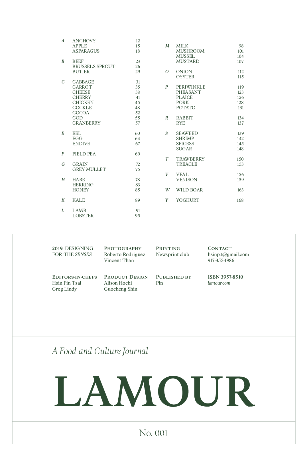

If you are interested in purchase Lamour and its type specimen, plaese contact me via email...
I found my interest in working with cultural-centric subjects through designing books and printed media. The font choice in editorial design is an essential visual element. My intention in this project is to create a typeface that embodied the sophistication of high culture but simultaneously, I wanted it to feel warm and welcoming.
Just like the beautiful abrupt modulation of the stroke in Romantic style writting, but also steady and flowing rhythm of Renaissance forms inviting readers to enter the text.
This is a font family for designers who deal with long text like in editorials. The process of typesetting is time-consuming so having a typeface like Lamour would be ideal for them because they wouldn’t have to tinker much with the typesetting and whatnot as much as they would with other typefaces.